The Ryerson Rams are now the TMU Bold. In addition to the new team name, a new mascot has also been chosen, changing from a ram to a falcon.
“Boldness is a core value of our university. It is shared by our students, reflected in our approach to learning and research, and demonstrated on the court, the field, and the rink by our athletes,” said president and vice-chancellor Mohamed Lachemi.
This change is part of TMU’s Next Chapter commitments. The selection of a new team name and mascot was one of the 22 recommendations put forward in a report by the Standing Strong Task Force in August 2021, which called for the university to reconsider the mascot “Eggy,” more formally Egerton the Ram, which had been the university mascot since 1961.
The parameters aimed to identify team name and mascot options that were:
- unifying for the TMU community;
- representative of positive qualities, ideals, or associations that align with TMU;
- broadly relevant across the community, student body, and among generations of alumni;
- representative of the TMU and/or Toronto experience and/or history, either generally or specifically;
- appropriate for all sports teams - regardless of gender or sport
- legally ownable and/or unique in the city/sector
TMU Bold was selected based on community feedback. People wanted a team name that was unique and confident as well as something that represented the values and aspirations of the university.
Community feedback was also an integral part in determining what mascot will accompany the new team name. The falcon was recommended nearly 40 times by community members, with one person saying, “a falcon represents keeping vigilant and transforming for the better, which is what [TMU] aims to do. Transform for the better, this is why I think a falcon would be the perfect mascot.”
New logo
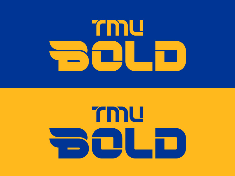
A new logo for the TMU Bold to be used in branded materials and uniforms moving forward was also unveiled last fall. The lines on both have been incorporated to mimic the lines on the court, the ice and the field. Taking the Bold logo a bit further, the ‘B’ has incorporated a subtle nod to the team mascot, a falcon. Falcons are known for their diving speed during flight, making them one of the world’s fastest animals. The top of the ‘B’ is curved in the shape of the falcon's body and beak as it dives at extreme high-speeds.
“The subtle hint to our team mascot, the falcon, gives the Bold logo some energy,” said Nuala Byles, marketing director for TMU Athletics and Recreation. “It's not overt, it’s subtle. It’s like our version of the Nike Swoosh.”
The Athletics and Recreation department tapped Jacknife Design, a Toronto-based branding and design agency, to help with the logo development. Byles says they chose Jacknife because of their experience with branding notable teams like the Toronto Marlies and the Toronto Football Club (TFC).


